Saturday, November 22, 2008

Presentation

My English Club has an upcoming activity, which is Presentation Competition. Therefore, I try to design some certificates for the winners. Basically, my leader requires me to make one simple frame, and then just add the name and the order of ranks on it. Based on that, I designed this work:


_ Again, I choose Garamond Premier Pro and Times for the fonts of text.
_ In addition to the two logos, the key is an interesting image. When I searched on the Internet to look for some sources of idea, I read a slogan: “Presentation skill – Key to success”. The word that impresses me is “Key” and I began to look for it. I found a nice image of old key from one of my favorite royalty free website – SXC:


Source: http://www.sxc.hu/photo/1045450

_ Now we have to select only the key. We can do it by using Lasso Tool to cut it slowly; however, it takes time and just causes more difficulties. Instead of Lasso Tool, I used Magic Wand Tool to select it quickly.

After I had done my work, I though of replacing the key by the appearance of human. I tried to find some abstract drawing and images of human. Finally, I found this one from SXC:


Source: http://www.sxc.hu/photo/1038123
I traced it in Illustrator and this is my work:


Here is my final version:

Mapping images to 3D objects in Illustrator

Most of my recent entries are about editing images in Photoshop. Therefore, I will move to Illustrator and Flash topics again in the future entries. Ok! Now I want to share with you an interesting tutorial about how to map images to 3D objects in Illustrator.

You can watch the original video tutorial at this link:
http://www.layersmagazine.com/mapping-photos-to-3d-objects-in-illustrator.html

Let’s begin our tutorial with the technical explanation first.
In order to wrap a photo around a 3D object, we have to turn it into a symbol in Illustrator. Thus, we have to import the photo by choosing File – Place. When it is chosen, you should notice the option Link below the Place menu. As you choose Link, the photo is imported to Illustrator and it is marked by a rectangle with two diagonal lines crossing each other.


Now the problem with Link is that the photo cannot be turned into symbol.
Open Window – Symbols to enter Symbol menu. When you drag the linked photo onto it, a warning will be displayed as “A symbol definition cannot contain a linked image”.


That means we place a photo into Illustrator while it is still linked to the external source file. It did not embed inside Illustrator. The solution for this problem is to embed the photo inside Illustrator document. There are two ways to do this.

+ When you choose File – Place, you can uncheck the Link option.
+ If you have already linked it, you open Menu – Links and click on the photo. Now there are some commands for Linked File on the top of Illustrator document. Just simply choose Embed. The other way is to go to the Link pop-up menu, click on the photo and then the small arrow to the right of the menu. Select Embed Image.


Step 1: Turn the photo into symbol
Import the photo inside Illustrator. Next, we turn it into a symbol as I mentioned how to do it previously. In the Symbol Options, name the new symbol and select Graphic type with the center Flash Registration point. The photo is now a symbol file, so you can delete it.


Step 2: Apply 3D effect to a shape
_ Draw a shape you like such as a rectangle.

_ Go to Effect – 3D – Extrude & Bevel. Actually, you can try Revolve because it is instructed in the original tutorial. However, I just want to use Extrude & Bevel because it is quite simple.
_ Select the Preview. You can set the Extrude Depth and Perspective to a level that we can see the 3D shape more clearly.
_ Also, you will see a cube map. It is the tool for you to move the 3D object freely so that you can watch it at different angles.


_ Next, select Map Art. Look at Symbol box and find your photo. You can see a model of it wrapped around the 3D shape in the main screen. Now we have a problem with the difference in size between the photo and the shape. If you want to make the photo match the shape’s size, just click on Scale to Fit. Then press OK and OK again.


_ So we have the result now. If you want to edit it again in 3D mode, you choose Window – Appearance - 3D Extrude & Bevel (Mapped).


_ You may want to change the color of the new shape. Select its Stroke and pick a color for it. So, you have a new color for the stroke and also the fill outline of the 3D shape. For example, I choose grey and the result is like this:


I hope that this tutorial is helpful to you. Here are my works:


Monday, November 10, 2008

Create outlines in Photoshop CS3

We have many effects in Photoshop to make our images, that are whether as a whole or a specified area, look better or more attractive. In some previous entries, the effect applied to parts of an image that I use frequently is Lighting Effects. This entry now introduces to you Outline effect, which you can use to edit certain areas of images. This effect does not have a technical name like “Blur” or “Lighting Effects”. Actually, it is a combination of many tools and effects to create outline of a certain part.

Let’s begin the tutorial. You can read the original tutorial at this link:
http://www.layersmagazine.com/developing-outlines-in-photoshop-cs3.html

Step 1: Smart Blur and Invert
_ Open an image that has the specific area you like to edit in Photoshop.
_ Duplicate the background (Com+J).
_ On Layer 1, choose Filter – Blur – Smart Blur.
+ Set Mode to Edge Only and Quality to High.
+ Change the Radius and Threshold to a value that gives details of outline.
+ Click OK, then press Com+I to invert the image.
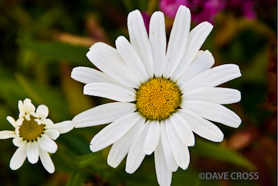
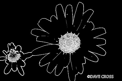
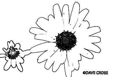

Step 2: Filter – Minimum
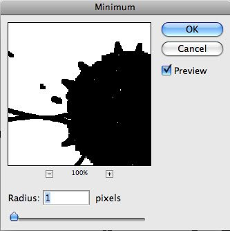
This step is used to make black lines thicker. Choose Filter – Other –Minimum.
Set Radius to 1 pixel. Then press OK.

Step 3: Edit the outline
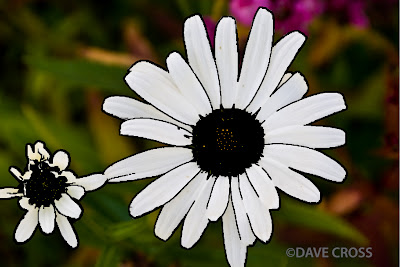
After you complete step 2, you can see that there are some parts that you do not want to cover as outline. Therefore, you need to delete it so that the specified area can be clearer. We will use Brush Tool and Opacity option to handle this job.
_ Use white for Foreground color. Then choose Brush Tool to clear the areas where you do not want to have outline.
_ Change Foreground color to black. Lower the Opacity of Layer 1 so that you can easily see the outline within the original colored background.
_ Use Brush Tool to enhance the black outline where needed.

Step 4: Layer Style – Blending Options
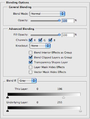
_ Double click Layer 1. In Blending Options, go to Blend If sliders at the bottom.
_ On This Layer, drag the white triangle to the left a bit. Now all the white areas around the outline become fully transparent and the original colored background is brought back.

Step 5: Mask
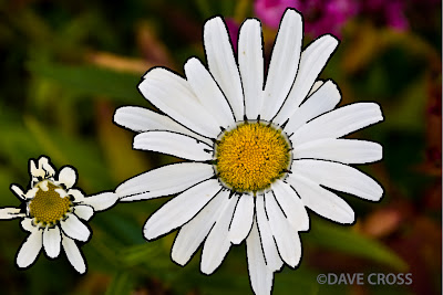
You can get some parts that have particularly strong outline. For example, the center of the flowers in the image we are using. You can lower it by following the instruction from the original tutorial, which uses Mask layers. However, I do not use that way to change it. I just simply use the Eraser Tool to clear the center part of the image and the result is still fine.

Step 6: Change outline color
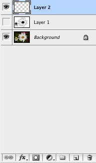
_ Create a new Layer by clicking on its icon at the bottom of the Layers Panel.
_ Drag it below Layer 1. Choose Layer 1, then you have two ways to merge the two layers:
+ Right click on Layer 1. In the pop-up menu, choose Merge Down.
+ Simply press Com+E.
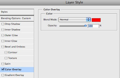
_ Double click on the new layer (Layer 2) to open Layer Style menu.
_ Go to Color Overlay. Click on the red color swatch to pick another color that you like for the outline.

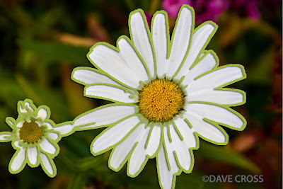

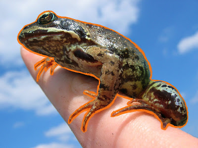
OK! It is done. I also did another work based on this tutorial and I want to share it with you. Here is the process of my work:
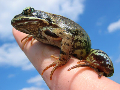
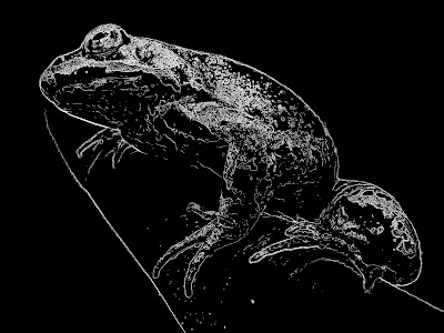
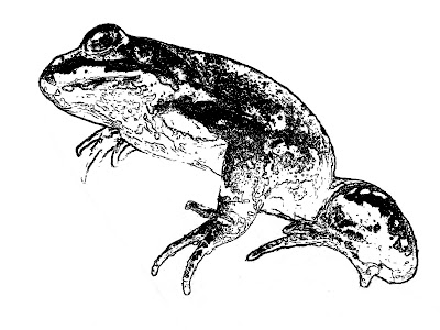
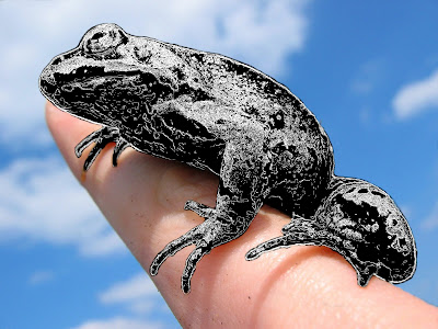
The upper image is my additional work, which is not in the process of creating outline. After I used Smart Blur and invert the effect for my image, the frog in its new skin makes me think of something interesting. So, I edit it a bit and use the Eraser Tool to clear the white area around the frog. Finally, we have a new frog on the hand.
Circle brush in Photoshop

Hello everyone! During the weekend, I have searched for new things about Photoshop and I found an interesting tutorial. The tutorial teaches us how to create colorful circles as a brush. Circle shape is a popular symbol that has been used in websites, posters, online advertisement, banners, etc. It is actually a group of circle layers.

You can find the original tutorial at this link: http://www.layersmagazine.com/trendy-circle-brush-in-photoshop.html
Ok! Let’s begin the tutorial.

Step 1: Create a new document
You should create a document with big size because it is better to make things larger than the normal size. As a result, you can make the brush smaller easily later. My choice is 1300 x 1300 pixels at 72 ppi.


Step 2: Main circle
_ Change the foreground color to white on the first layer, than duplicate the layer.
_ Use Ellipse Tool to draw a nice circle. Select the current layer, double click on Layer thumbnail and set the color to black.


Step 3: Duplicate layers
_ Duplicate the shape layer. Double click on the new Layer thumbnail and set the color to white.
_ Now make the circle smaller. You can do this by clicking Edit – Free Transform Path or the shortcut Com+J in Mac. Reduce its size until you have a white circle with black stroke around it. Finally, you press OK to complete the transformation.
_ Repeat step 3 a number of times so that you can have many circles inside another one. You can use any color for each circle. However, the tutorial gives an advice that we should use contrasting colors such as black and white.


Step 4: Change circle to a brush
_ Use Rectangular Marquee Tool to make a square selection around the circle.
_ Click Edit – Define Brush Preset. Give the new brush a name and click OK to save it.
_ Important notes:
+ If you do not see Define Brush Preset option, click Show All Menu Items.
+ If Define Brush Preset is not available, choose another layer and retry.


Step 5: Create new file
Now we are going to use the new brush in a new background.
Create a new file with the size of 800 x 150 pixels. Then you can set the foreground color to any option that you like.


Step 6: Select the new brush
_ Choose the Brush Tool. Then click Window – Brushes.
_ Now we have the Brush panel. Choose Brush Tip Shape. Then scroll the list to the right to find the circle brush we made.
Change Diameter to 65 px and Spacing to 75%.
Click on Shape Dynamics and change Size Jitter to 60%.
Click on Scattering and change Scatter to 300%.
Click on Color Dynamics and set both Foreground/Background Jitter and Saturation Jilter to 50%, leave the rest as 0%. Now you are done in Brush panel.
_ Go back to main window, set Foreground and Background color to your favorites.


Step 7: Use the new brush
Create a new layer. Now just click the mouse and drag anywhere you like.

Thursday, November 6, 2008

Modified certificate

I hope that you like my certificate design in the last entry. I am happy with my final work because I have tried my best to do it. The nice thing is that it fits the requirement such as logos of RMIT and English club, important signature areas, main text. I also chose the fonts of text that are suitable with the certificate. They increase the readability of text content in a formal document like certificate.

However, I have a problem with my work. After I sent the example of it to the club leader, he thought that it was not nice-looking and he does not like it. He asked me to take a look at some certificates of English club in the past. In order to help you understand the old ones visually, I also post an image of them in this entry. Here it is:


I think that this one is nice. The designer has a good layout for the text and the background. In my opinion, the formality of an important document like certificate requires clear content. You do not need to draw flowers and natural patterns or even colorful background in order to make it visually appealing. The certificate does not need that to say you have done something good for an organization or the public. Anyway, it is just my thought and I want to share it with you. I have tried to make some changes for my work and I hope you can give me advice on them. Here they are:


Sound buttons in Flash

During the break time, I review some of the flash tutorials in class. For me, the most difficult part is how to make the sound buttons in Flash. At this point, I mean how to use them to control the music in Flash project. Content is important but sound has a great contribution to the final result. I have made a correct tutorial for creating sound buttons based on class materials and the Internet. Now I want to share it with anyone who has problem with using sound in Flash. We will go through the process with Play, Stop, and Pause buttons.

1) Play – Stop:
_ Import music or sound clip to Flash.
_ Right click on the music file in the Library and choose Linkage – Export for ActionScript. Then name it in Identifier box.


_ Create two layers: one for the sound, another for buttons.
_ In layer 1, put this Action code in frame 1:
var snd = new Sound ( );
snd.attachSound (“name of the sound clip in Identifier”);

+ Note: If you want the music to play automatically at the beginning and it does not play over one another with the Play button, you add two more lines:
_root.snd.stop ( );
_root.snd.start ( );
_ In layer 2, create Play and Stop buttons.
_ Put this code in Play button:
on (release) {
_root.snd.start ( );
}
And you just change “start” to “stop” in the ActionScript for Stop button.

2) Play – Pause:
_ In a new Flash file, create two layers like the previous session.
_ In order to make Pause function, we need to put the sound clip into a Movie clip.

+ Insert – New Symbol – name the Movie Clip.
+ Import sound clip to Library. Go to the Movie clip timeline.
+ Leave the first frame, insert keyframe on frame 2.
+ In the Properties Panel at the bottom of the screen, click Sound and select your sound clip.
+ Set Sync to Stream. We do not need to loop, so just choose 0 time for Repeat.


+ From frame 2, insert a keyframe to the ending point of the sound clip based on the length of your sound.
+ Add stop action in the first frame because we just want to play the music only when the Play button is activated, not when the file is loaded at the beginning.

_ Go back to main timeline. Drag the Movie clip to layer 1.
_ Name the instance of the Movie clip.
_ Add Play and Pause buttons to layer 2.
_ Put this ActionScript to Play button:
on (release) {
tellTarget (“name of the instance”){

play ( );

}
}

You just change “play” to “stop” for the Pause button.

Ok! We have done the tutorial. Hope you will have no difficulty with sound buttons in Flash.

3) Technical information:
_ When you choose the Sync, there are two options that we need to know: Event and Stream.

+ Stream means we try to match the length of sound clip with the timeline. When the timeline ends, the sound ends too. Sound that is set as Stream should not be looped.

+ Event means sound clip plays until it is done. In other words, the length of sound is independent of the timeline’ length.

_ If you want to know the quality of sound clip formats such as WAV and MP3 in Flash, it needs experiment. I have tried a lot and figure out that WAV has good quality in both Event and Stream option. On the contrary, MP3 works well at Event but it is worse in Stream.