Saturday, September 6, 2008

Background images 2

In the previous entry, I had some of the background images for you. Now I will show you more of my progress on the project. These images in this post will be more interesting than in the previous one because I have to spend hours drawing them. You will see a nice fish, a Chinese angel, my mooncake buttons, and the layout of some steps. Furthermore, there is an image of the cloud in this post and I created it by adding and rotating the Spiral symbol in Illustrator.

Here is my continuous progress.


Background images

As we are on the process of doing the tutorial in Flash, I would like to share my background images with you. My tutorial is about how to choose good mooncakes. Therefore, my project includes many images that come from Chinese culture. I have to say that Chinese symbols are not easy to draw as they have many curves and straight lines arranged in different ways. One of the most difficult images that I have to draw is a fish and it took me almost three hours. However, it was funny to do challenge jobs. At the end, I feel satisfied with what I have created so far.

Now it is the time to show you my progress.


Sunday, August 31, 2008

Mashup storyboard

As I promised, I will show you my storyboard for the mashup project. The topic that I have chosen is noise pollution. I want to warn people of high level of noise in our life. As we create more modern things, they seem to fight against us and disturb our life with loud noises. I have to create a one minute audio/visual mashup and no video clip can be used for longer than 5 seconds. As a result, there will be 12 clips in my video mashup.


Saturday, August 30, 2008

Mashup project

As we are studying multimedia design, anything related to media content such as images, audio or text can interest us. I found a new type of media called “mashup”. It is also the final project for my Multimedia Engineering class.

Generally speaking, a mashup is a digital combination of all kinds of media content, including text, graphics, audio, video and animation created from pre-existing sources. The final goal of mashup is to create a new derivative work based on those original materials and to send a message that we want to say about our topics of interest. We can do mashup about political or social issues, or types of entertainment that interest us. Again the problem of intellectual property and copyrighted material is still obvious in mashup because we use different sources for one work. However, if we pay attention to this problem and we keep the process of using materials carefully like we did in class, we can make a nice mashup video.

Now I want to introduce to you the materials that I have found for my mashup project. They are free to use as they are under the rights of Public Domain and other licenses of Creative Common License. You can find out more information about the protection of copyrighted material and the freedom that we can have in using them at this link: http://www.creativecommons.org/.


Source of animation: http://www.archive.org/details/bb_stop_that_noise

Betty Boop: Stop That Noise is an old cartoon produced by Max Fleischer. This cartoon can be freely reproduced or used because it has the permission from Public Domain license. In the next entry, I will show you the storyboard of my mashup, which is quite interesting.


Source of video: http://www.archive.org/details/patronsavoicnoise


Source of video: http://www.archive.org/details/swiss_trick

Another two videos that are free to use is Swiss Trick and Patrons Avoid Noise. Swiss Trick (1931) was produced by John Foster and Patrons Avoid Noise was a movie theater advertisement that tells people to keep silent while watching the movie.

Friday, August 22, 2008

Simple could animation - Text mask effect

A) Simple cloud animation:

Moving clouds in our movie makes it more interesting than ever, especially with background images that contain clouds like mountain, forest, or the beach. This tutorial will give you a simple way to do it.


1) Link for tutorial: http://www.flashfridge.com/tutorial.asp?ID=90


2) Tips:

_ Although the tutorial requires us to set the alpha of the cloud movie clip to 26%, you should set it more than or equal 70%. I get this result as I have tried 26% and the clouds do not appear clearly.

- When you want to adjust an image to match the stage, you should turn on the Align panel. You then choose Align horizontal center and Align vertical center in order.


3) Example of my work:


B) Text mask effect:

If you have a nice texture background and a simple text, you can make a creative text effect from them by using mask effect and simple motion tween.


1) Link for tutorial: http://blog.0tutor.com/default.aspx?cat=flash&paging=15


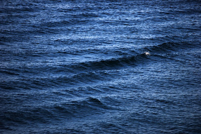
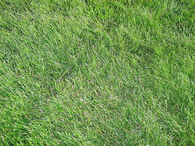
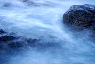
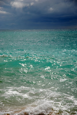
2) Texture background can be images in nature, which are a group of elements that has the same colors or shapes such as water, grass or fire. You can type the text in any font and choose a suitable color for background so that the text can appear clearly.

However, I have a problem with testing the movie. When I press Command + Enter to check it, the result only show the movement of the texture image. When I press Enter from the frame 1, I can see the text mask effect. If you know how to make it work when replay the movie, please let me know.


3) As a result, I cannot use movie clips to show the text effect. Therefore, I try to export it through images so that you can see and I also put the texture images for them. Here are examples of my work:
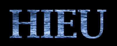


Source of image: http://www.sxc.hu/browse.phtml?f=download&id=1059495
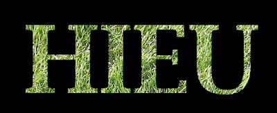


Source of image: http://www.sxc.hu/browse.phtml?f=download&id=1060411
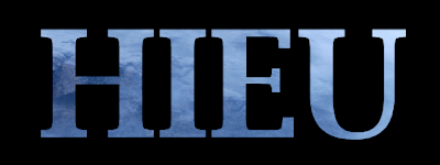


Source of image: http://www.sxc.hu/browse.phtml?f=download&id=1059383
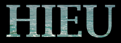


Source of image: http://www.sxc.hu/browse.phtml?f=download&id=1059488

Shining neon playback button

If you want to make a nice – looking button, this tutorial will be helpful. Adding light effects for the button creates an interesting playback interface, especially with the neon light.


1) Link for tutorial: http://www.lukamaras.com/tutorials/menus-interfaces/glowing-neon-playback-controls.html


2) Tips:

_ If you cannot find the Set Corner Radius icon, it is in the Properties panel and near the Reset button. It looks like this:


_ Remember to take notes of these color codes: #2E70AA, #FFFFFF, #7CCFFC, #3A5274.

_ You cannot apply the Gradient Transform Tool to the shape. Just select the tool, click on the shape to select it, and click on the focus point of the shape.

_ In step 23, the tutorial asks you to set 3 white color squares in the gradient bar. If you keep doing like it instructs, it will be really hard for you to get the desired result like the tutorial. In order to get it done, I set the color code of two color squares on each end of the gradient to #3A5274. Then, I add another color square in the middle of the gradient and set it to a lighter color in the color bar. It should look like this:


3) Here is example of my work:


And here is the original result of the tutorial, which looks nicer than me:

Sunday, August 17, 2008

Your own cool background

You are boring with choosing photographs or still images that have been given in Photoshop to make a background. Now it is time to explore your own idea and create a completely new background, based on the tools that we have learnt. In this tutorial, we will get experience in using Pen Tool, Blending Options, Layers, and Brush Tool.


1) Here is the link for the tutorial:
_ Reference: http://www.adobetutorialz.com/articles/2999/1/Cool-abstract-background


2) Tips:

_ You may find difficulty using the Pen Tool to draw a wavy line. It is better to draw the first line of the wave. Then you make a higher point at the edge of the frame so that the line becomes a little vertical while you curve it at the same time. Next, it will be easier for you to continue the second line.

_ If you want to make a group of layers, the “Create a new group” option is in the bottom part of the Layer panel, near the symbol “Create a new layer”.

_ Another important thing is that some steps require you to use Brush tool on a separate layer. You should follow that instruction: create a new layer, use brush tool to make your shapes, and edit their blending mode. Remember not to draw new shapes on previous layers because you will get stuck with grouping too many shapes on a same layer.


3) I hope this tutorial is interesting to you. Here is example of my process, which can gives you a visual help.