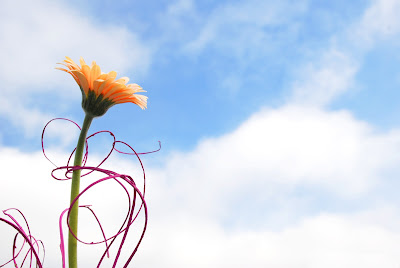
1) Version 2.1:

_ Additional image:

Because the image is so bright, I need to lower its brightness a bit. Here are my steps:
+ Go to Image – Adjustments – Shadow/Hightlight, then set the Amount of Highlight to 20%.
+ In Adjustments, select Brightness/Contrast. Set Contrast to +35 and Brightness to +5.
2) Version 2.2:

No comments:
Post a Comment