Wednesday, December 24, 2008

Birthday card 2

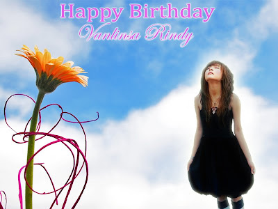
I hope that my series of birthday card entries will not make you feel boring. This is the second work that I just did after the first one, and it also includes two versions.

1) Version 2.1:


_ Additional image:


Because the image is so bright, I need to lower its brightness a bit. Here are my steps:
+ Go to Image – Adjustments – Shadow/Hightlight, then set the Amount of Highlight to 20%.
+ In Adjustments, select Brightness/Contrast. Set Contrast to +35 and Brightness to +5.

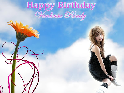
2) Version 2.2:

Birthday card 1

Hi everyone! Today is Christmas night and I want to wish all my friends a wonderful night with happiness. Furthermore, better news is that Vietnamese national football team has defeated Thailand team for the first match and I am so proud of them.

Ok! Come back to the main task. I have designed some birthday cards to celebrate my friend’s birthday. Her name is Vanlinsa Rindy. In order to help me make the cards, she gave me some pictures of herself. So, let’s take a look at them:


I chose the second and third images after careful consideration. Based on this, I made two versions of the card.

1) Version 1.1:


_ Additional image: Remember our Gestalt theory exercise folder. You can look for this image in it.


_ The fonts of text: I want to choose a nice font for her name and other greeting words. I think that the best way is writing a word in Flash to examine the appearance of it in any font you like. It is more effective than using Illustrator or Photoshop to find the same result. There are four fonts I really like. They are Lucida Calligraphy, Harrington, Edwardian Script ITC, and Snell Roundhand. The word “Happy Birthday” is in Cambria and her name “Vanlinsa Rindy” is in Edwardian Scrip ITC.

_ I found out that yellow and green really supports each other well. I select yellow for the color of text and it is more impressive in the green background of flowers. I also add light green to Outer Glow layer style to make the words match the background. “fffa00” and “9efb66” are addresses for yellow and light green.

2) Version 2.2:


The first difference is color of the name. In the first version, it is yellow while it is white in the second one. Second difference is a new image of Rindy in this version.

Friday, December 19, 2008

Final horror DVD cover

Finally, I have done my DVD cover design, including text content and logos on it. Organizing the names of characters and technical staff, and the logo of company took me a lot of time. I have to say it is not easy because it needs concentration and precision.

When I looked at some DVD cover models, I found out that two fonts are often the maximum number used in them. One can be serif and the other one can be sans – serif. Based on that, I decided to use two fonts, which are Arial and Cambria.
Now let me show you my final works:


Horror DVD cover 3

This entry is the next step in my process of making a scary DVD cover. I have made different versions of the DVD cover, which are based on various images related to horror. First, let’s take a look at those source images:

Author: scol22
Source: http://www.sxc.hu/photo/1032928

Author: marekwo
Source: http://www.sxc.hu/photo/299356

Author: marekwo
Source: http://www.sxc.hu/photo/299357

Now move on to my works:


For the background image of an old wall, I lowered its opacity to 40% and set the Contrast to 100%. This image will stay the same for all versions later.

The moon image is in red so that it can match the theme. In order to get it, I changed the Saturation to add light red to it; then I went to Color Balance to increase the red percentage. Finally, I set the Contrast of it at 100% to make it attractive.

A substitute for the moon is a bloody astronomical clock. It has the same process of editing as the moon. Furthermore, white glow is added to the clock and I used Brush Tool to throw small drops of blood onto its surface.

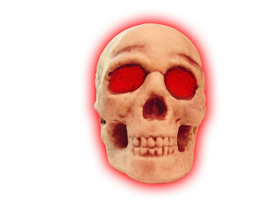
In the third version, the headless angel is cut from its original image. Red glow covers around the shape to make it look scary. The last image is a small empty tomb with two angels. I took away from its original one by using Eraser Tool. Next, I set it to Black & White mode so that the skull can stand out of it.

Sunday, December 14, 2008

Horror DVD cover 2

I will continue with the process of making the DVD cover first. As I follow my plan, I decide to create the background images for the cover and add the text content later. Here is the process of my first step:


Horror DVD cover 1

Hello everyone! Another challenge is coming to me and that is print project for DVD cover and DVD label. This is also the first time I put my hands on the horror genre. When I think of something scary, there are lots of things pop up in my mind. As a result, I hardly figure out a right image for the topic. Therefore, I solve the problem by writing out on the paper some words that I can have in my mind:
Terror - Horror - Fear - Frighten - Panic
Halloween - Grave - Panic - Candles - Death
Darkness - Fire - Skeleton - Cemetery - Crosses
After that, I have searched for some images related to those words. Here is the result:


Saturday, December 6, 2008

Ranked certificates

Customers always want to add new things at the last moment and that is also a problem I have to deal with. My leader wants me to design not only a certificate for the winners of the Presentation Competition but also three versions of it for the first, second, and third - rank winners.

Actually, the main structure of the new design is the same as the certificate of contribution. A new task now is to add two logos of the Dance club and Ultimate Frisbee club and to make the three versions different a bit. Fortunately, I have came up with the idea of creating a difference between the first rank, second rank, and third rank when I looked at the chessman in the contribution certificate. I decide to describe the best winner as a king, the second winner as a bishop, and the last winner as a castle.

Now it is the time to show the process of my works. First, we need to take a look at the two new logos:


Ok! We now move on to the source images:


Author: woodsy
Reference: http://www.sxc.hu/photo/921520


Author
: ilviale
Reference: http://www.sxc.hu/photo/621733

Author: Henkster
Reference: http://www.sxc.hu/photo/722932

Here are my works:


My first collage

Although collage and montage are interesting design fields, I found that they are quite challenging for me as it is the first time I try to do a collage. Another problem is that finding different source images for my work takes a lot of time. However, as soon as I keep my mind on the theme of my collage, that difficult task can be done. Let’s see what I have found:


Author: Undy
Reference: http://www.sxc.hu/browse.phtml?f=download&id=476996


Author: haloocyn
Reference: http://www.sxc.hu/browse.phtml?f=download&id=935764


Author: LeWy2005
Reference: http://www.sxc.hu/browse.phtml?f=download&id=1089158

Author: iliana
Reference: http://www.sxc.hu/browse.phtml?f=download&id=162731


Author: holamaria
Reference: http://www.sxc.hu/browse.phtml?f=download&id=1113789


Author: ftibor
Reference: http://www.sxc.hu/browse.phtml?f=download&id=916602


Author: n_yfe
Reference: http://www.sxc.hu/browse.phtml?f=download&id=295501


Author: ilco
Reference: http://www.sxc.hu/browse.phtml?f=download&id=995995

And here is my final work:


The theme used in this collage is “the poor”. I choose the image of a messy floor as a background for my work. This image is set in black and white colors so that the rest of images with colors will stand out the background.
The second image is an old homeless person sleeping on a bench. I choose this image because it matches the appearance of poor people. All the rest of images are money and food, which are the things that poor people really need. The upper image area, which is specified by glowing outline, represents a dreaming breakfast for the poor. Finally, the image of money is put on the person as a blanket because money is what poor people want.