Sunday, January 25, 2009
Thursday, January 8, 2009
Interface Typographic project 2
This entry will be the conclusion of my motion graphics project. In the previous one, I introduced to you about the BadTyp font and its characteristics, as well as the source images that I will use in the project.
Now let’s move on to a short advertising content for the font:
An inconsistency of font design
Created by Leslie Cabarga in 1993
Bureau BadTyp
Based on worst examples of amateur lettering
Has the most common lettering mistakes
Only contains bad combinations in type
Lower case – Upper case
Thick – Thin
Sans serif – Serif
Bureau BadTyp
Here is the visual process combining text and images:


I use the image of Pisa Tower, which is a famous architectural structure that might fall down in the near future, to match the word “inconsistency”.


The image of a headless angel is used here to describe the words “worst examples” and “mistakes”. It fades in slowly and moves up until it reaches the headless part.


Finally, we stop at the main menu of the flash file, which contains 4 options, a sound button and a replay button.

Let’s take a look at what will appear when I choose BadTyp Character Chart. You can view the complete Latin character chart of BadTyp font in the following image:

Reference: http://www.fontbureau.com/fonts/BadTyp/charset

Because the font is for purchase, I must trace each letter and number for my Character Chart content.
Ok! This is the end for my project. I hope that you are interested in this topic.
Wednesday, January 7, 2009
Interface Typographic project 1
Hello everyone! This entry will be about my motion graphics project in Flash that introduces the letterform features of a font. After I have researched many fonts, I decide to choose the font BadTyp, owned by Font Bureau.
Next, I will post the introduction of this font:
+ "Lettering artist and graphic designer Leslie Cabarga has been charmed all his life with the eccentricities in amateur lettering, especially those found in logos and sign painting.”
(http://new.myfonts.com/fonts/fontbureau/badtyp/)
+ In his own words — … “The computer has blurred the line between type and lettering allowing type to become less conservative, less boringly regular, and to allow many idiosyncracies of lettering. With my font BadTyp, I spent years collecting the worst examples of lettering and created a font designed to teach people to recognize the most common lettering mistakes. There is only one basic error in font design and that’s inconsistency.”
(http://www.fontbureau.com/people/LeslieCabarga)
+ "The single font of BadTyp combines all kinds of bad combinations, cap and lowercase, thick and thin, serif and sans, to create an intriguing style radiating perverse charm and love of the naive.
Design details:
* Designers: Leslie Cabarga
* Design date: 1993
* Design owner: Font Bureau
* Publisher: Font Bureau
* MyFonts debut: Jan 1, 2000"
(http://new.myfonts.com/fonts/fontbureau/badtyp/)
Finally, here are the source images that I will use in the project:

Author: carre23
Reference: http://www.sxc.hu/photo/888020

Author: Cissaborba
Reference: http://www.sxc.hu/photo/1029612

Author: bjearwicke
Reference: http://www.sxc.hu/photo/1078275

Author: andrewatla
Reference: http://www.sxc.hu/photo/911121

Author: juuichimei
Reference: http://www.sxc.hu/photo/1115658

Author: andreyutzu
Reference: http://www.sxc.hu/photo/1124490

Author: marekwo
Reference: http://www.sxc.hu/photo/299357
Friday, January 2, 2009
Birthday card 4
This is the final version of my birthday card. It includes same Photoshop techniques and the couple of bear and rabbit. Because their feathers are mostly dark and light yellow colors, I decide to make yellow as the main background color. I took a look at many birthday cards and tried to find the most familiar images or symbols related to birthday celebration.
Here is the source image:
 Author: malachite1
Reference: http://www.sxc.hu/photo/792670
And here is the final version:

_ Text: They look the same like previous cards because I use the same fonts. However, the final greeting sentence is newer and more popular to us. I do not use any glow effect for the text and the fill color is purely black.
_ Bear and rabbit: I select them separately from their original image. I then add light yellow for Outer Glow effect so that they can match the background color. The location of the light yellow is R: 255 – G: 255 – B: 190.
_ The stars: You can trace them from other images of the stars because it is hard to draw them in Photoshop with ordered straight lines. I use white for both the fill color and the outer glow.
Birthday card 3
At the moment I am writing this entry, I have done the third version of the birthday card. I hope to make one more version so that I have four greeting cards to give to my friends. This time the card will be a bit different. Vanlinsa suggests me to make a card with cute things such as dolls. However, I am not interested in toys for girls like that. Finally, I come up with the idea of using some funny animals and there are two couples of them. They are bear and rabbit, cat and dog. This entry will be for cat and dog.
Here are the source images for this card:
 Author: CraigPJ
Reference: http://www.sxc.hu/photo/926701
 Author: scol22
Reference: http://www.sxc.hu/photo/880342
And here is the 3rd version:

_ Cambria and Edwardian Script ITC are two fonts of text. Fill color of the words are yellow (R: 243 – G: 252 – B: 0). I also add black (R: 0, G: 0, B: 0) as the stroke to these words. As a result, I figure out that yellow words covered by black stroke are really clear and attractive.
_ Cat and dog: I use Magic Wand Tool to select them from their original image. After that, I use Eraser Tool to clear unwanted details remaining in the new image. This process took me a lot of time. Finally, I use light grey (R: 215, G: 215, B: 206) for creating Out Glow effect.
Wednesday, December 24, 2008
Birthday card 2
I hope that my series of birthday card entries will not make you feel boring. This is the second work that I just did after the first one, and it also includes two versions.
1) Version 2.1:
_ Additional image:

Because the image is so bright, I need to lower its brightness a bit. Here are my steps:
+ Go to Image – Adjustments – Shadow/Hightlight, then set the Amount of Highlight to 20%.
+ In Adjustments, select Brightness/Contrast. Set Contrast to +35 and Brightness to +5.
2) Version 2.2:
1) Version 2.1:

_ Additional image:

Because the image is so bright, I need to lower its brightness a bit. Here are my steps:
+ Go to Image – Adjustments – Shadow/Hightlight, then set the Amount of Highlight to 20%.
+ In Adjustments, select Brightness/Contrast. Set Contrast to +35 and Brightness to +5.
2) Version 2.2:

Birthday card 1
Hi everyone! Today is Christmas night and I want to wish all my friends a wonderful night with happiness. Furthermore, better news is that Vietnamese national football team has defeated Thailand team for the first match and I am so proud of them.
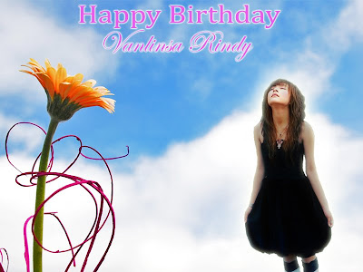
Ok! Come back to the main task. I have designed some birthday cards to celebrate my friend’s birthday. Her name is Vanlinsa Rindy. In order to help me make the cards, she gave me some pictures of herself. So, let’s take a look at them:


I chose the second and third images after careful consideration. Based on this, I made two versions of the card.
1) Version 1.1:

_ Additional image: Remember our Gestalt theory exercise folder. You can look for this image in it.

_ The fonts of text: I want to choose a nice font for her name and other greeting words. I think that the best way is writing a word in Flash to examine the appearance of it in any font you like. It is more effective than using Illustrator or Photoshop to find the same result. There are four fonts I really like. They are Lucida Calligraphy, Harrington, Edwardian Script ITC, and Snell Roundhand. The word “Happy Birthday” is in Cambria and her name “Vanlinsa Rindy” is in Edwardian Scrip ITC.
_ I found out that yellow and green really supports each other well. I select yellow for the color of text and it is more impressive in the green background of flowers. I also add light green to Outer Glow layer style to make the words match the background. “fffa00” and “9efb66” are addresses for yellow and light green.
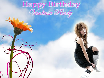
2) Version 2.2:

The first difference is color of the name. In the first version, it is yellow while it is white in the second one. Second difference is a new image of Rindy in this version.
Ok! Come back to the main task. I have designed some birthday cards to celebrate my friend’s birthday. Her name is Vanlinsa Rindy. In order to help me make the cards, she gave me some pictures of herself. So, let’s take a look at them:


I chose the second and third images after careful consideration. Based on this, I made two versions of the card.
1) Version 1.1:

_ Additional image: Remember our Gestalt theory exercise folder. You can look for this image in it.

_ The fonts of text: I want to choose a nice font for her name and other greeting words. I think that the best way is writing a word in Flash to examine the appearance of it in any font you like. It is more effective than using Illustrator or Photoshop to find the same result. There are four fonts I really like. They are Lucida Calligraphy, Harrington, Edwardian Script ITC, and Snell Roundhand. The word “Happy Birthday” is in Cambria and her name “Vanlinsa Rindy” is in Edwardian Scrip ITC.
_ I found out that yellow and green really supports each other well. I select yellow for the color of text and it is more impressive in the green background of flowers. I also add light green to Outer Glow layer style to make the words match the background. “fffa00” and “9efb66” are addresses for yellow and light green.
2) Version 2.2:

The first difference is color of the name. In the first version, it is yellow while it is white in the second one. Second difference is a new image of Rindy in this version.
Subscribe to:
Posts (Atom)