Sunday, November 30, 2008

Certificate of contribution

Hello everyone! As you read my entry Presentation, you know that I a working on designing a certificate for the event Presentation Competition of RMIT English Club. Actually, I have made some examples of the certificate for the winners of the competition. Now I have another task, which is to design certificates for members who contribute to the event.

Based on previous comments that I have received, I decide to change some features of the last design. For example, most of the text content is in italic form, except for the title of the certificate and name of the awarded person. I also move the text area up to the top and the image area to the bottom. This means two logos and additional images are put below the signature area. Another change is that I use images of the chess to represent those members who contribute to organize the event. They play an important role as the king in the chessboard because the event will not be run without their helps. I use the same technique to edit images, which is using Magic Wand Tool to select chessmen and Eraser Tool to clear unnecessary details around the chessmen.

Let's take a look at the source images that I have used for my new design:


Photo by woodsy
Reference: http://www.sxc.hu/photo/921525


Photo by woodsy
Reference: http://www.sxc.hu/photo/921520

Here are my works:


Research Paper - Paul Rand

In this entry, I want to introduce to you my research paper about Paul Rand, one of famous American graphic designers. Although Paul Rand has a great collection of logos and trademarks for many organizations, I just pick three pieces of his work to analyze them critically. They are logos for ABC (The American Broadcasting Company), IBM, and Westinghouse. Here is my work:


Paul Rand (August 15, 1914 – November 26, 1996) was a famous American graphic designer of the twentieth century. He was known for great logo and trademark designs such as the logos for Coronet Brandy, NeXT Computers, and English First. Rand studied at the Pratt Institute (1929-32), the Parsons School of Design (1932-33) and the Art Students League (1933-34). He taught at Yale University from 1956. Rand began his career by working for some magazine and newspaper agencies such as Esquire, Apparel Arts, and Direction magazines. Furthermore, he published his principles of graphic design in famous books Thoughts on Design (1947), A Designer’s Art and Design, Form, and Chaos (1985). Inspired by the works of European modernist masters, he combined the style of modern art with corporate identity. This idea was experienced by a series of successful trademarks for major organizations, including the logos of IBM, Westinghouse and ABC.


Reference: http://paul-rand.com/assets/gallery/identity/logo_ibm_large.jpg

The 8-bar blue IBM logo designed by Paul Rand is one of the most recognizable trademarks in the world. In this logo, horizontal lines were used to replace the solid letters of its previous versions. Three letters were developed from a square-serif typeface known as City Medium (Communication Arts 1999). They have similar geometric shapes and same visual weight in the composition. Furthermore, blue color makes them stand out against the white background. As a result, the word “IBM” becomes a dominant element in the whole design. The effect of proximity concept of Gestalt theory is very obvious. Close space between each letter unifies them into a specific group. Because the letters are aligned from left to right, they create a sense of continuance. Horizontal lines also contribute to the unity of the design. The regular rhythm of them suggests dynamic movement for the viewer’s eyes. Moreover, the effect of closure created by the strips helps viewers recognize the letters in an interesting way. The stripping lines act as a great grouping tool that makes the logo a well – designed one.


Reference: http://paul-rand.com/assets/gallery/identity/logo_abc_large.jpg

Another famous corporate trademark created by Paul Rand is the redesigned logo for ABC, which is known as “ABC Circle” (Paul Rand – Corporate Identity Designs, Innovation and Excellence 2007). Sans serif typeface is used frequently in logo design and it is the same for this logo. The font of it is sans serif developed by the inspiration from Bauhaus (Communication Arts 1999). All three letters are in lower case and placed inside a circle. Therefore, the composition has a vertical axis to organize them and creates a sense of horizontal symmetry. This kind of balance combining with curved shapes of the letters suggests stability of the design. Moreover, proximity concept of Gestalt is used again as each of the character is placed closed to each other. White is the main color of the letters and it makes the word “abc” becomes a dominant element, which stands out against the dark background. Equal amounts in color, shape, and position of each letter maintain the unity of the word ‘abc’ in the whole composition. As a result, the logo receives a simple recognition as well as memorable content.


Reference: http://paul-rand.com/assets/gallery/identity/logo_westinghouse_large.jpg

The last trademark is Rand’s design for Westinghouse, an American electrical company. The unique element in this logo is the letter “W” which represents electrical circuitry (History of Modern Design 2003). It is constructed by rounded tops of diagonal lines. The effect of continuance concept of Gestalt theory is described through the direction of diagonals lines, which suggests dynamism and motion. Furthermore, circle shapes denote a free movement and protection. Because the circular components overlap the diagonal ones, they seem to form a strong group in the composition. In addition, color of the letterform is black, which contrasts the white background. As a result, the group “W” becomes dominant in the overall composition and its unity is enhanced strongly. The logo is a successful one based on effective combination of overlap proximity and the similarity in symbolized geometric shapes.

In conclusion, the three logos for IBM, ABC, and Westinghouse are best results of Paul Rand’s talent. His typography is innovative because he has interesting ways of bringing letters together to create a visually appealing image, as seen in logos for IBM and ABC. The strength of simplicity is also used in these logos to create a memorable image in viewer’s minds. Furthermore, three Gestalt concepts including closure, proximity, and continuance are used effectively in three logos. Simple geometric shapes and lines, colors in contrast, and good balance between elements in the composition contribute greatly to the unity of each design. His remarkable heritage of trademarks and logos is a clear illustration of his thought: “A logo does not sell (directly), it identifies.” (Logos, Flags, and Escutcheons 1991).


Ok! That’s it. I especially like his thought of logo design in my final conclusion: “A logo does not sell (directly), it identifies”. I hope to receive your comments for my research paper.

Saturday, November 22, 2008

Presentation

My English Club has an upcoming activity, which is Presentation Competition. Therefore, I try to design some certificates for the winners. Basically, my leader requires me to make one simple frame, and then just add the name and the order of ranks on it. Based on that, I designed this work:


_ Again, I choose Garamond Premier Pro and Times for the fonts of text.
_ In addition to the two logos, the key is an interesting image. When I searched on the Internet to look for some sources of idea, I read a slogan: “Presentation skill – Key to success”. The word that impresses me is “Key” and I began to look for it. I found a nice image of old key from one of my favorite royalty free website – SXC:


Source: http://www.sxc.hu/photo/1045450

_ Now we have to select only the key. We can do it by using Lasso Tool to cut it slowly; however, it takes time and just causes more difficulties. Instead of Lasso Tool, I used Magic Wand Tool to select it quickly.

After I had done my work, I though of replacing the key by the appearance of human. I tried to find some abstract drawing and images of human. Finally, I found this one from SXC:


Source: http://www.sxc.hu/photo/1038123
I traced it in Illustrator and this is my work:


Here is my final version:

Mapping images to 3D objects in Illustrator

Most of my recent entries are about editing images in Photoshop. Therefore, I will move to Illustrator and Flash topics again in the future entries. Ok! Now I want to share with you an interesting tutorial about how to map images to 3D objects in Illustrator.

You can watch the original video tutorial at this link:
http://www.layersmagazine.com/mapping-photos-to-3d-objects-in-illustrator.html

Let’s begin our tutorial with the technical explanation first.
In order to wrap a photo around a 3D object, we have to turn it into a symbol in Illustrator. Thus, we have to import the photo by choosing File – Place. When it is chosen, you should notice the option Link below the Place menu. As you choose Link, the photo is imported to Illustrator and it is marked by a rectangle with two diagonal lines crossing each other.


Now the problem with Link is that the photo cannot be turned into symbol.
Open WindowSymbols to enter Symbol menu. When you drag the linked photo onto it, a warning will be displayed as “A symbol definition cannot contain a linked image”.


That means we place a photo into Illustrator while it is still linked to the external source file. It did not embed inside Illustrator. The solution for this problem is to embed the photo inside Illustrator document. There are two ways to do this.

+ When you choose FilePlace, you can uncheck the Link option.
+ If you have already linked it, you open MenuLinks and click on the photo. Now there are some commands for Linked File on the top of Illustrator document. Just simply choose Embed. The other way is to go to the Link pop-up menu, click on the photo and then the small arrow to the right of the menu. Select Embed Image.


Step 1: Turn the photo into symbol
Import the photo inside Illustrator. Next, we turn it into a symbol as I mentioned how to do it previously. In the Symbol Options, name the new symbol and select Graphic type with the center Flash Registration point. The photo is now a symbol file, so you can delete it.


Step 2: Apply 3D effect to a shape
_ Draw a shape you like such as a rectangle.

_ Go to Effect3DExtrude & Bevel. Actually, you can try Revolve because it is instructed in the original tutorial. However, I just want to use Extrude & Bevel because it is quite simple.
_ Select the Preview. You can set the Extrude Depth and Perspective to a level that we can see the 3D shape more clearly.
_ Also, you will see a cube map. It is the tool for you to move the 3D object freely so that you can watch it at different angles.


_ Next, select Map Art. Look at Symbol box and find your photo. You can see a model of it wrapped around the 3D shape in the main screen. Now we have a problem with the difference in size between the photo and the shape. If you want to make the photo match the shape’s size, just click on Scale to Fit. Then press OK and OK again.


_ So we have the result now. If you want to edit it again in 3D mode, you choose WindowAppearance - 3D Extrude & Bevel (Mapped).


_ You may want to change the color of the new shape. Select its Stroke and pick a color for it. So, you have a new color for the stroke and also the fill outline of the 3D shape. For example, I choose grey and the result is like this:


I hope that this tutorial is helpful to you. Here are my works:


Monday, November 10, 2008

Create outlines in Photoshop CS3

We have many effects in Photoshop to make our images, that are whether as a whole or a specified area, look better or more attractive. In some previous entries, the effect applied to parts of an image that I use frequently is Lighting Effects. This entry now introduces to you Outline effect, which you can use to edit certain areas of images. This effect does not have a technical name like “Blur” or “Lighting Effects”. Actually, it is a combination of many tools and effects to create outline of a certain part.

Let’s begin the tutorial. You can read the original tutorial at this link:
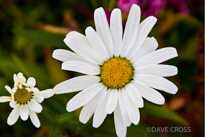
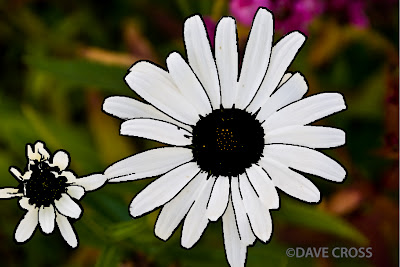
http://www.layersmagazine.com/developing-outlines-in-photoshop-cs3.html

Step 1: Smart Blur and Invert
_ Open an image that has the specific area you like to edit in Photoshop.
_ Duplicate the background (Com+J).
_ On Layer 1, choose Filter – Blur – Smart Blur.
+ Set Mode to Edge Only and Quality to High.
+ Change the Radius and Threshold to a value that gives details of outline.
+ Click OK, then press Com+I to invert the image.


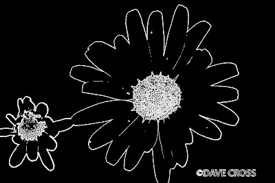
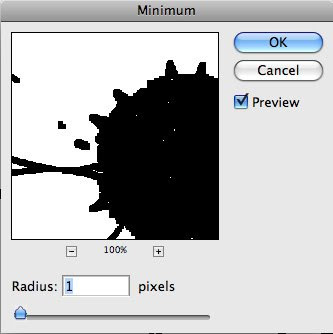
Step 2: Filter – Minimum
This step is used to make black lines thicker. Choose Filter – Other –Minimum.
Set Radius to 1 pixel. Then press OK.


Step 3: Edit the outline
After you complete step 2, you can see that there are some parts that you do not want to cover as outline. Therefore, you need to delete it so that the specified area can be clearer. We will use Brush Tool and Opacity option to handle this job.
_ Use white for Foreground color. Then choose Brush Tool to clear the areas where you do not want to have outline.
_ Change Foreground color to black. Lower the Opacity of Layer 1 so that you can easily see the outline within the original colored background.
_ Use Brush Tool to enhance the black outline where needed.


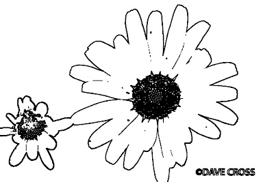
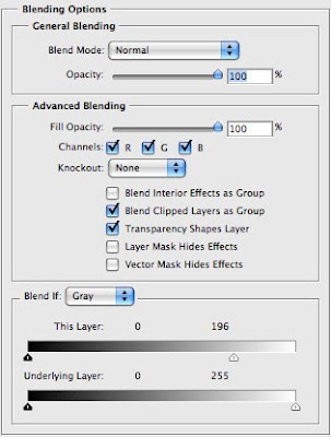
Step 4: Layer Style – Blending Options
_ Double click Layer 1. In Blending Options, go to Blend If sliders at the bottom.
_ On This Layer, drag the white triangle to the left a bit. Now all the white areas around the outline become fully transparent and the original colored background is brought back.


Step 5: Mask
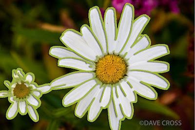
You can get some parts that have particularly strong outline. For example, the center of the flowers in the image we are using. You can lower it by following the instruction from the original tutorial, which uses Mask layers. However, I do not use that way to change it. I just simply use the Eraser Tool to clear the center part of the image and the result is still fine.


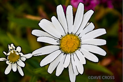
Step 6: Change outline color
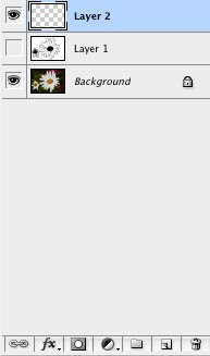
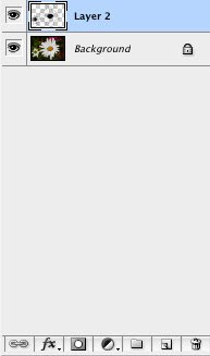
_ Create a new Layer by clicking on its icon at the bottom of the Layers Panel.
_ Drag it below Layer 1. Choose Layer 1, then you have two ways to merge the two layers:
+ Right click on Layer 1. In the pop-up menu, choose Merge Down.
+ Simply press Com+E.
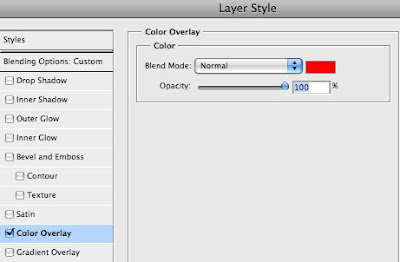
_ Double click on the new layer (Layer 2) to open Layer Style menu.
_ Go to Color Overlay. Click on the red color swatch to pick another color that you like for the outline.


OK! It is done. I also did another work based on this tutorial and I want to share it with you. Here is the process of my work:


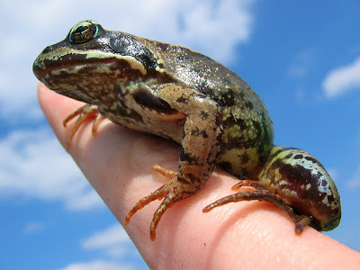
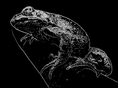
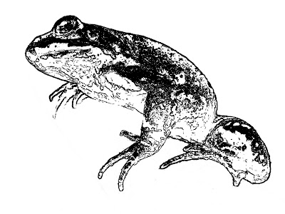
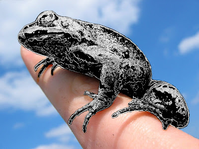
The upper image is my additional work, which is not in the process of creating outline. After I used Smart Blur and invert the effect for my image, the frog in its new skin makes me think of something interesting. So, I edit it a bit and use the Eraser Tool to clear the white area around the frog. Finally, we have a new frog on the hand.

Circle brush in Photoshop

Hello everyone! During the weekend, I have searched for new things about Photoshop and I found an interesting tutorial. The tutorial teaches us how to create colorful circles as a brush. Circle shape is a popular symbol that has been used in websites, posters, online advertisement, banners, etc. It is actually a group of circle layers.

You can find the original tutorial at this link: http://www.layersmagazine.com/trendy-circle-brush-in-photoshop.html
Ok! Let’s begin the tutorial.

Step 1: Create a new document
You should create a document with big size because it is better to make things larger than the normal size. As a result, you can make the brush smaller easily later. My choice is 1300 x 1300 pixels at 72 ppi.


Step 2: Main circle
_ Change the foreground color to white on the first layer, than duplicate the layer.
_ Use Ellipse Tool to draw a nice circle. Select the current layer, double click on Layer thumbnail and set the color to black.


Step 3: Duplicate layers
_ Duplicate the shape layer. Double click on the new Layer thumbnail and set the color to white.
_ Now make the circle smaller. You can do this by clicking Edit – Free Transform Path or the shortcut Com+J in Mac. Reduce its size until you have a white circle with black stroke around it. Finally, you press OK to complete the transformation.
_ Repeat step 3 a number of times so that you can have many circles inside another one. You can use any color for each circle. However, the tutorial gives an advice that we should use contrasting colors such as black and white.


Step 4: Change circle to a brush
_ Use Rectangular Marquee Tool to make a square selection around the circle.
_ Click Edit – Define Brush Preset. Give the new brush a name and click OK to save it.
_ Important notes:
+ If you do not see Define Brush Preset option, click Show All Menu Items.
+ If Define Brush Preset is not available, choose another layer and retry.


Step 5: Create new file
Now we are going to use the new brush in a new background.
Create a new file with the size of 800 x 150 pixels. Then you can set the foreground color to any option that you like.


Step 6: Select the new brush
_ Choose the Brush Tool. Then click Window – Brushes.
_ Now we have the Brush panel. Choose Brush Tip Shape. Then scroll the list to the right to find the circle brush we made.
Change Diameter to 65 px and Spacing to 75%.
Click on Shape Dynamics and change Size Jitter to 60%.
Click on Scattering and change Scatter to 300%.
Click on Color Dynamics and set both Foreground/Background Jitter and Saturation Jilter to 50%, leave the rest as 0%. Now you are done in Brush panel.
_ Go back to main window, set Foreground and Background color to your favorites.


Step 7: Use the new brush
Create a new layer. Now just click the mouse and drag anywhere you like.